


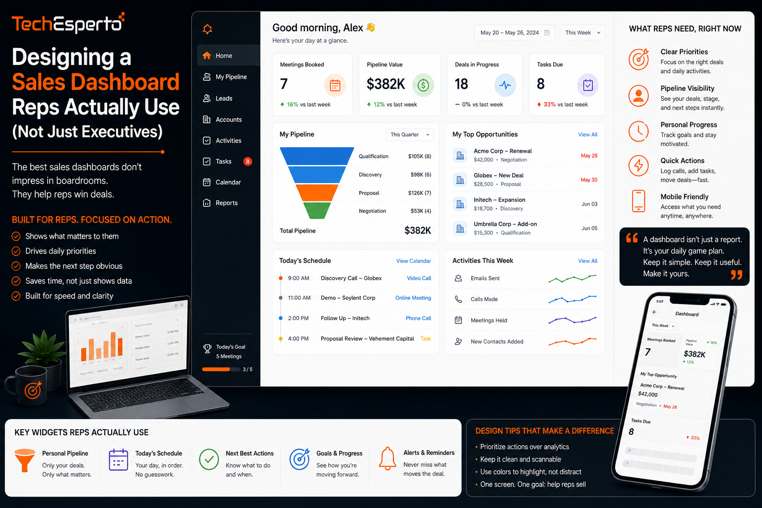
Designing a Sales Dashboard Reps Actually Use (Not Just Executives)
Sales dashboard design usually starts with what leadership wants to see in a weekly review, and the result is often a dashboard packed with executive-level summary metrics that a sales rep has no reason to check day to day. This post covers how to design a dashboard built specifically around what a rep needs to act on daily, separate from the reporting layer built for leadership, so both audiences actually use the tools built for them.
Why One Dashboard Rarely Serves Both Audiences Well
Executives generally want aggregated, trend-based views, such as total pipeline value or win rate over time. Reps need something entirely different: a clear view of what needs their attention today, including overdue follow-ups, deals approaching a deadline, and leads sitting untouched. Trying to serve both needs on a single dashboard usually results in something too cluttered for daily use and too granular for a leadership review.
What a Rep-Focused Dashboard Should Prioritize
Actionable, Not Just Informational
A dashboard reps actually open regularly surfaces what needs to happen next, rather than simply displaying numbers. Overdue tasks, deals with no activity in a defined period, and leads nearing a response deadline should be immediately visible, ideally sorted by urgency rather than buried in a general activity feed.
Personal Pipeline View
Reps benefit from a dashboard scoped specifically to their own accounts and deals rather than a company-wide view, since the volume of company-wide data is not relevant to their daily decisions and adds noise that slows down finding what matters.
What an Executive Dashboard Should Prioritize
Leadership dashboards should emphasize trends and aggregates, such as pipeline value by stage, win rate over recent periods, and forecast accuracy compared to actual closed revenue. This audience generally checks the dashboard on a weekly or monthly cadence rather than daily, so the emphasis is on pattern recognition over immediate action items. This kind of reporting typically draws on broader business intelligence tooling to aggregate data across the full sales organization rather than a single rep’s activity.
Common Design Mistakes That Reduce Adoption
A frequent mistake is including too many metrics on a single view, which forces a user to scan past irrelevant information to find what actually matters to them. Another common issue is building a dashboard once and never revisiting it as the sales process changes, leaving it reflecting a workflow the team no longer follows. And dashboards that require several clicks to reach the most important information tend to get checked less often than one where the critical view loads immediately, since friction, even small friction, meaningfully reduces daily usage.
Building Dashboards That Update in Real Time
A dashboard is only as useful as how current its data is. If figures update only once a day through a batch process, reps working with time-sensitive information may be making decisions on data that is already stale by the time they check it. Real-time or near-real-time dashboard updates, pulled directly from live CRM data, are a meaningful part of what makes a dashboard genuinely trustworthy for daily decision-making, an area covered further in dashboard development work focused specifically on keeping displayed data current rather than relying on periodic refreshes.
Getting Feedback From the People Who Use It
The most reliable way to know whether a dashboard is actually working is asking the reps who are supposed to be using it whether they check it regularly and why or why not. Dashboards designed without this feedback loop often look reasonable on paper but go unused in practice because they were built around assumptions about what reps need rather than direct input from the people doing the daily work.
Key Takeaways
Rep-focused dashboards and executive dashboards serve different needs and generally should not be the same view, since reps need actionable, personal data while executives need aggregated trends. Rep dashboards should prioritize what needs immediate attention rather than general informational metrics. Common design mistakes include overcrowding a single view, failing to revisit design as processes change, and adding unnecessary friction to reach key information. And real-time data updates, along with direct feedback from actual users, are what separate a dashboard that gets used from one that gets ignored.
Frequently Asked Questions
Should sales reps and executives use the same dashboard?
Generally no. Reps need actionable, personal, near-real-time views, while executives need aggregated trend data, and combining both into one view usually serves neither audience well.
How often should a sales dashboard’s design be reviewed?
It should be revisited whenever the sales process changes meaningfully, since a dashboard built around an outdated workflow gradually becomes less relevant to what reps actually need to see.
What is the most common reason sales reps stop using a dashboard?
Dashboards that are cluttered with irrelevant metrics or require too many clicks to reach the most important information tend to see declining daily use over time.
Does real-time data matter for every type of sales dashboard?
It matters most for rep-focused, action-oriented dashboards where decisions are time-sensitive. Executive dashboards reviewing longer-term trends can often work well with less frequent data updates.
How do you measure whether a dashboard redesign actually improved adoption?
Tracking how often the dashboard is accessed before and after a redesign, combined with direct feedback from the reps using it, gives a clearer picture than assuming a new design is an improvement based on appearance alone.